
The 3-Minute Demo: How Your Interface Decides Whether You Close the Round
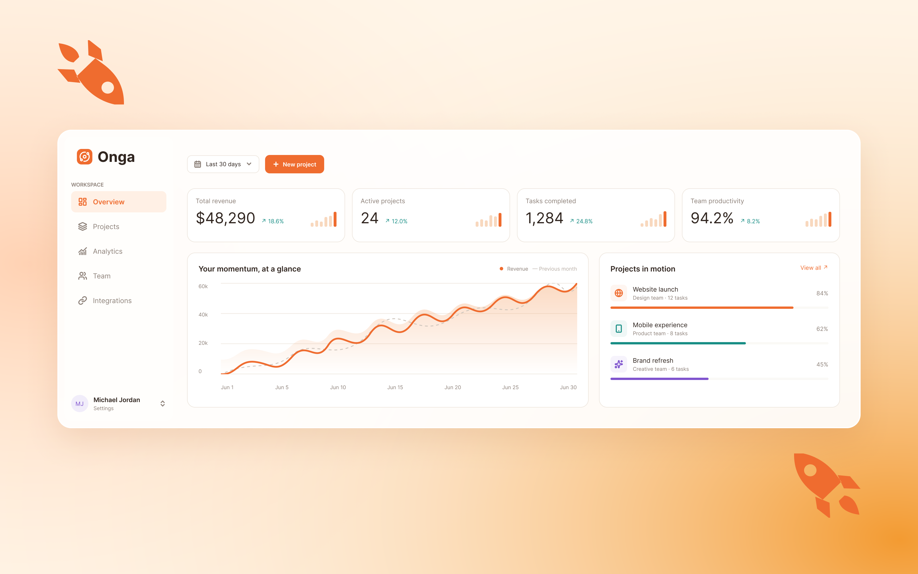
Partners at a seed or Series A firm sit through several pitches a day. By the fourth demo, the clinical rigor behind your model is already lost on them. What remains is a feeling about whether the product looks like something a hospital would buy.
That feeling forms fast. Usually before you finish your first sentence about the architecture.
The Investor Illusion: Why Algorithmic Superiority Fails Clean UI
Your model may be the best in its category. The investor across the table cannot verify that. A generalist partner does not read validation cohorts in a meeting, does not audit your feature engineering, and has no way to tell a well-calibrated classifier from a lucky one in real time.
So they substitute. The interface becomes a visual proof-of-concept for everything they cannot inspect. Tidy, legible, and decisive screens read as evidence of a disciplined engineering team. A crowded, ambiguous dashboard reads as the opposite, and the inference runs in a straight line: confusing product, confused users, slow adoption, high churn, missed revenue projections.
Call this the investor illusion. It is not fair, and it is not irrational either. A partner is pricing risk under time pressure, and interface quality is the only observable signal available. If your screen cannot explain itself, the investor assumes a hospital buyer will struggle the same way, only with less patience and a procurement committee attached.
There is a second effect: investor cognitive fatigue. Every element on screen costs attention. A partner who spends the first ninety seconds decoding your layout has nothing left to evaluate your market. Clutter does not merely look bad. It burns the exact resource you need to win.
Clean design does not hide weak science. It stops strong science from being discounted by a bad first impression.
The 3 Fatal Interface Mistakes That Scare Away Venture Capital
Mistake 1: The “Everything, Everywhere” Dashboard
Founders pack every capability onto a single screen because breadth feels like traction. Patient lists, risk scores, trend charts, task queues, messaging, analytics, and settings, all visible at once, all competing.
Investors read this differently than you intend. Breadth on a single layout signals a lack of prioritization, and prioritization is the core skill in product leadership. A team that cannot decide what matters on one screen will struggle to decide what matters on a roadmap, a sales pitch, or a pricing page.
Look at it from the buyer’s side too. A health system’s reviewer asks one question of any dashboard: what do I do first? If the screen offers twenty answers, the product has no answer at all.
Mistake 2: Missing the Time-to-Value Proof
Many demos spend the first several minutes on signup, configuration, patient selection, and filter setup. The moment the product solves the core problem arrives late, if it arrives at all.
In a three-minute window, that sequencing is fatal. Investors want Time-to-Value (TTV) clarity: a fast, observable path from opening the product to seeing the problem solved. If they must wait through setup to reach the payoff, they conclude your customers will wait too. They also conclude that onboarding is expensive, which means high customer acquisition cost and slow deployments.
Setup clicks tell a story about your sales cycle. Make sure the story is short.
Mistake 3: Generic B2B Visual Identity
A default component library, a stock blue gradient, and a template-grade layout all read as the same thing: a prototype. In health tech, that impression carries extra weight, because buyers purchase trust before they purchase features.
A product handling protected health information needs to look governed. Inconsistent spacing, mismatched icons, unclear permission states, and missing audit cues suggest a team that has not yet confronted the realities of clinical software. Investors know that compliance, security review, and clinical credibility are what slow health-tech deals. An interface that appears unready for that scrutiny raises their estimate of the work ahead.
The target is the visual register of a clinical operating system: calm, dense where it should be, quiet everywhere else, and consistent to the pixel.
The Pitch-Ready UX Overhaul Blueprint
Three changes rebuild a demo around the way investors actually evaluate.
Step A: Design a High-Impact Hero State
The hero state is the first screen after login. It should show a result, not a menu.
Preload the demo account with realistic data that makes the product’s value self-evident. If you reduce readmissions, open on a ranked list of patients with a one-line reason beside each, and a single highlighted action. If you speed up documentation, open on a completed note and a visible measure of time saved.
Use these rules:
- One dominant element. The eye should land on the main result in under two seconds.
- A visible outcome metric. Show the number your buyer cares about, framed against a baseline, so the TAM-to-UX translation is immediate: a large addressable problem rendered as a small, solvable one on screen.
- Reasons beside outputs. Never show a score without a one-line explanation of why.
- No empty states. A blank chart in a demo reads as a broken product.
Rehearse the path to the hero state until it takes one click.
Step B: Streamline Persona Visual Flows
Hospitals buy for two audiences at once: the clinician who uses the product and the administrator who justifies it. Your demo should prove viability for both, quickly.
Build a persona switch into the demo itself, ideally a single toggle. Show the clinician’s view first: sparse, task-driven, focused on the next action. Then flip to the administrator’s view: utilization, outcomes, cost impact, and audit trail.
This does three things. It shows you understand the buying committee. It demonstrates role-based access without a slide about it. And it supports product-led growth indicators, since clinician adoption plus administrator visibility is the pattern that expands a pilot into an enterprise contract.
Keep the two views visually distinct but clearly part of one system, with shared navigation and consistent type.
Step C: Build Interactive Proof of Interoperability
Every investor with healthcare experience asks the same question: does it connect to the EHR? A slide with logos is a claim. A working surface is proof.
Show interoperability inside the interface:
- A launch-in-context moment. Open the product from a simulated chart with the patient already loaded, demonstrating a SMART on FHIR style launch.
- A visible sync indicator. Display what data was pulled, from which source, and how recently.
- A write-back confirmation. Show your output landing in the record as structured data.
- A readable integration status panel. One screen listing connected systems and their health.
If you operate against a sandbox rather than a live production EHR, say so. Investors with domain experience will notice, and honesty about the sandbox buys more credibility than an overstated claim. The goal is to de-risk adoption velocity: the investor should leave convinced that deployment inside a hospital’s existing stack is a configuration task, not a research project.
The Direct ROI of Great UX
Design spend is easy to treat as cosmetic. It behaves more like a lever on deal risk.
Shorter diligence. A product that explains itself generates fewer follow-up questions and fewer requests for a second demo. Each avoided meeting removes days from the timeline.
Stronger conviction at the partner meeting. Your champion inside the firm has to re-present your product to colleagues who were not in the room. A memorable, coherent interface gives them a story to repeat. A cluttered one gives them nothing to defend.
Lower perceived execution risk. Investors discount valuation for uncertainty. A polished, role-aware, integration-ready product reduces the uncertainty they can see, which strengthens your negotiating position on terms.
Better downstream sales signals. The same clarity that wins the investor shortens hospital evaluations, which feeds the pilot-to-contract conversion metrics your next round will scrutinize.
None of this replaces traction. It helps traction get believed.
Run Your Own Three-Minute Test
Record your current demo, then watch it with the sound off.
Mark the second when the first meaningful result appears on screen. If it is past thirty seconds, your TTV clarity has a problem. Count the elements competing for attention on your busiest screen. Ask someone outside healthcare to explain, in one sentence, what the product does. If they cannot, a generalist partner will not manage it either.
Cut the screen until it can only say one thing. Then rebuild the demo around that.